
FEATURED PROJECTS

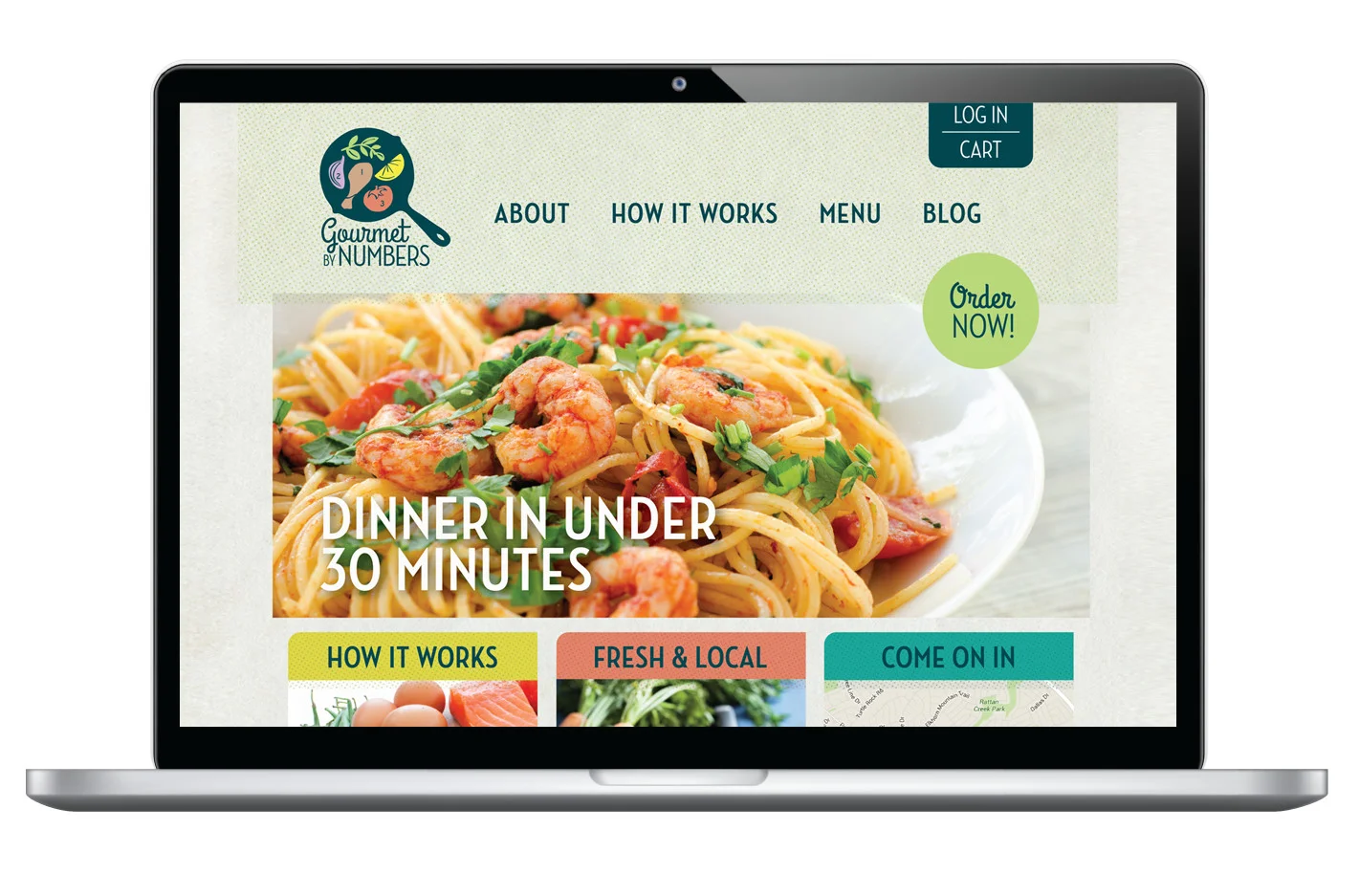

GOURMET BY NUMBERS
Gourmet by Numbers’ owner had a clear vision for how her company would function, but communicating this new concept in semi-home cooking meal kits was a challenge. With no chopping or measuring needed, the kits work like a paint-by-number for creating easy dinners. This playful concept became the foundation for the brand, and the skillet logo found its way onto car wraps, totes, referral cards, websites and more.
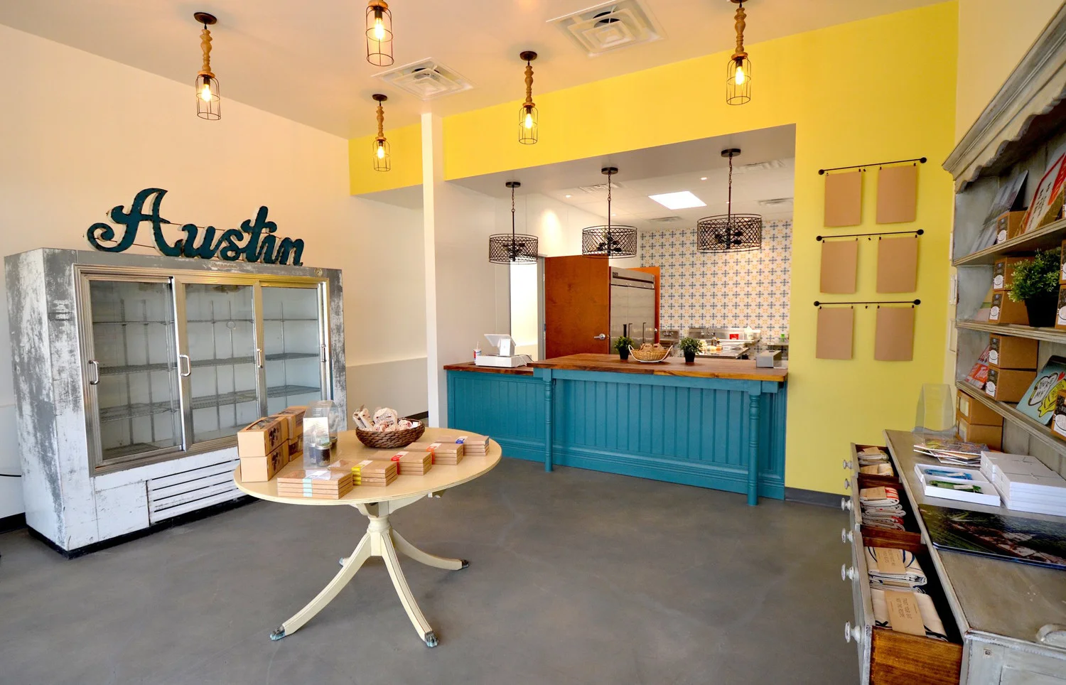
The Gourmet By Numbers space is a combined kitchen / retail shop, encompassing both preparation and sale of the meal kits. It was designed to feel like a home kitchen — bright, warm, cheery, welcoming, clean and friendly.
The kitchen and office areas were arranged to allow one person to man the shop while working in the kitchen, as well as to accommodate multiple kitchen staff as the company grows. The retail space is easy to shop, with the kitchen in full view so you know exactly where and how your meal kit was prepared. The triple-duty, economical space plan ensures easy replication in future locations, too.


FRIENDS OF THE TEXAS HISTORICAL COMMISSION
As a Texan, this pro bono project was easy to embrace: create an invitation for a truly Texas night to remember, all to benefit the preservation of our great state through the Friends of the Texas Historical Commission.
Frontier reenactors, the official longhorn herd of Texas and a fast-talking cattle auctioneer were the stars, and the oak grove at the James Beard “American Classics” award winning Perini Stakehouse the stage — it truly felt like a night on the last frontier.
The invitations feature moon-and-stars colored typography set on a deep, night sky background and invite folks from all over Texas to the experience.
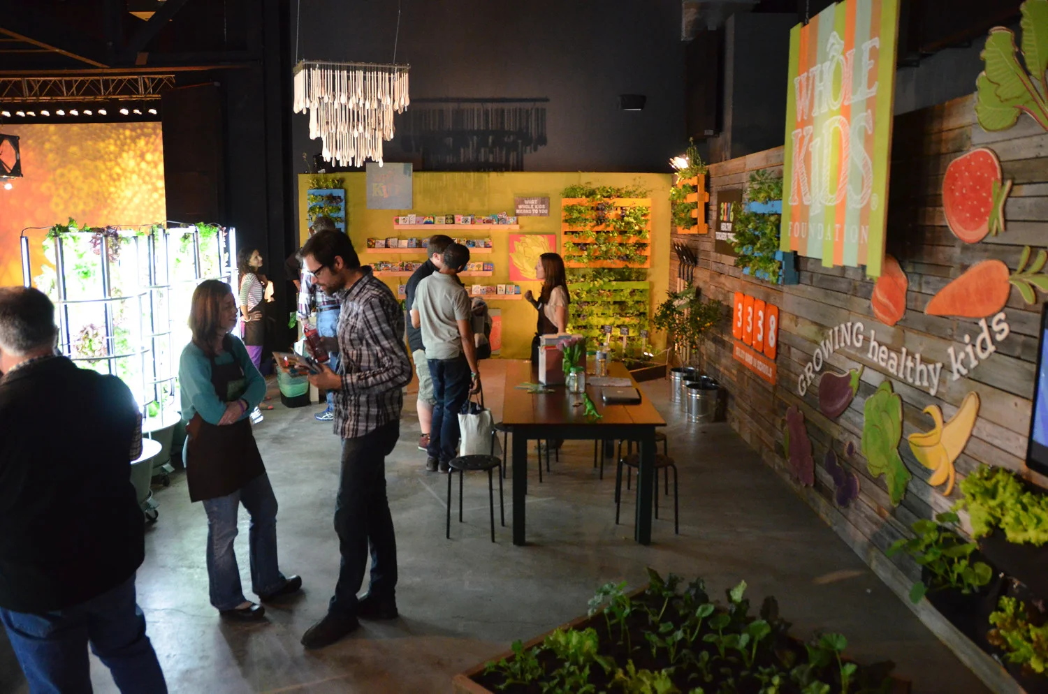
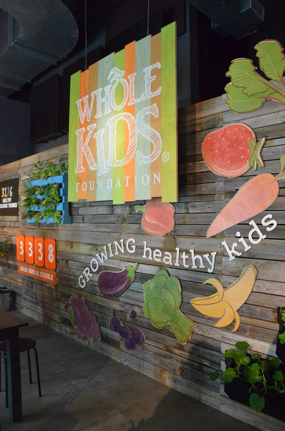


THE WHOLE KIDS FOUNDATION EXPERIENCE
The Whole Kids Foundation is dedicated to improving children’s nutrition and wellness, and supports programs in school classrooms, cafeterias, communities and Whole Foods Market stores.
The Foundation was in need of an immersive experience to showcase their programs and successes at Whole Foods Market Tribal Gathering, an event that draws over 2,000 company leaders from around the globe. The space also doubled as a “take-home idea zone,” where each element was designed to inspire easy reproduction in a retail space.
400 square feet of edible plants fill garden beds and hanging gardens made from recycled palettes. Heads of lettuce grow in hydroponic towers. Cafeteria trays, shovels and a chandelier made from wooden spoons provide whimsy in the space.


JEREMIAH CUNNINGHAM'S WORLD'S BEST EGGS
Let me start by saying Jeremiah is one of the most amazing men I’ve ever met, which was years ago, before he was selling eggs. I visited the farm to get to know him and his business.
Our farm tour included his prize bull, named Fifty-Two, the shiny organic feed mill elevators and two rambunctious puppies, Blue and FlyBye. He spoke proudly of his family. We looked carefully at grass. I learned some of the finer points of a cow patty and his formula for rotating the chickens in the fields. He told me he hoped anyone who bought his eggs would come on out to the farm for a tour, he wanted people to know the chickens were happy.
Jerry said free roaming chickens eating organic feed were happy chickens, and they would lay the “World’s Best Eggs,” and that’s what he wanted to call them. When I asked if he would allow me to add “Jeremiah Cunningham’s” to the name, he paused, took his hat off and looked at the ground. It made him suddenly shy. I tried to tell him it personalized the brand. Luckily his girlfriend knew where I was going, she leaned over to him and said, “Darling, you just don’t waste a name like Jeremiah Cunningham.”
The egg cartons and feed bags I designed would eventually feature Jerry’s invitation to visit the farm and images of his grandsons, Fifty-Two, the mill and of course, “the girls” — his chickens.


Mood Board
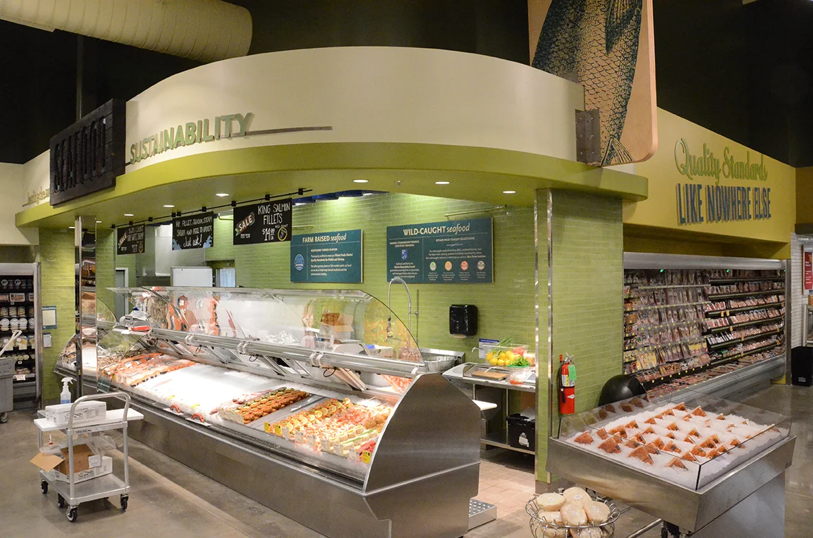
WHOLE FOODS MARKET OKLAHOMA CITY
Every Whole Foods Market store is designed to find the intersection of the brand and the community in which the store will exist, reflecting the neighborhood and aspirations of the community.
Oklahoma City was a brand new market for the company. The new development in which the store was situated was decidedly modern, and the store shell was designed to blend with the modern shopping center but still feel distinctly Whole Foods Market.
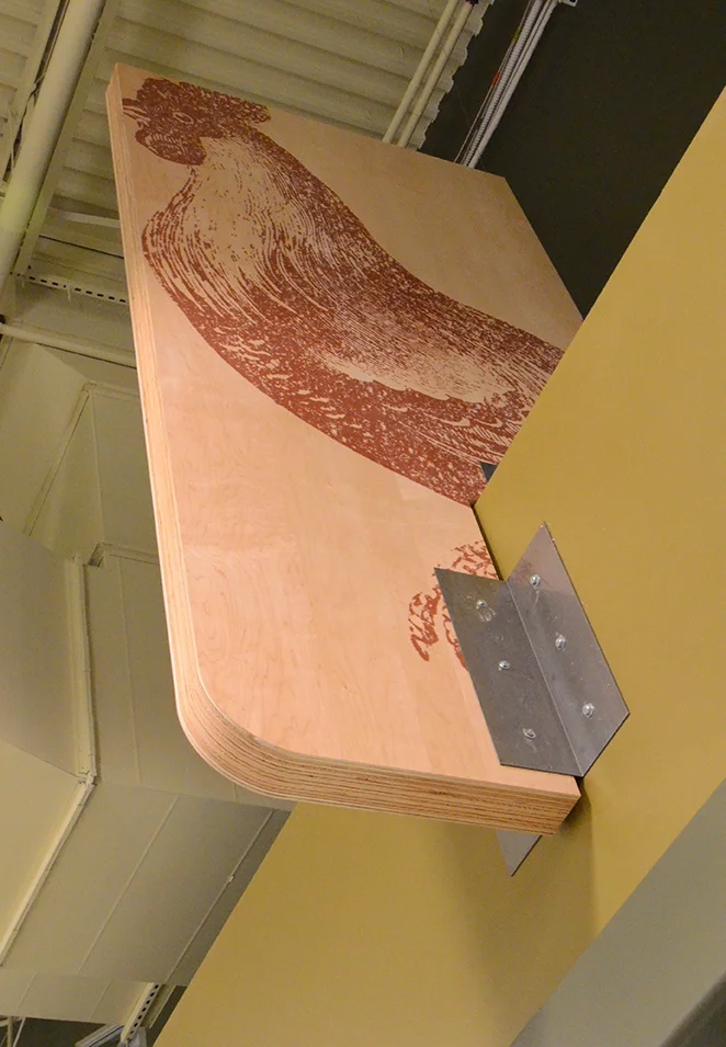
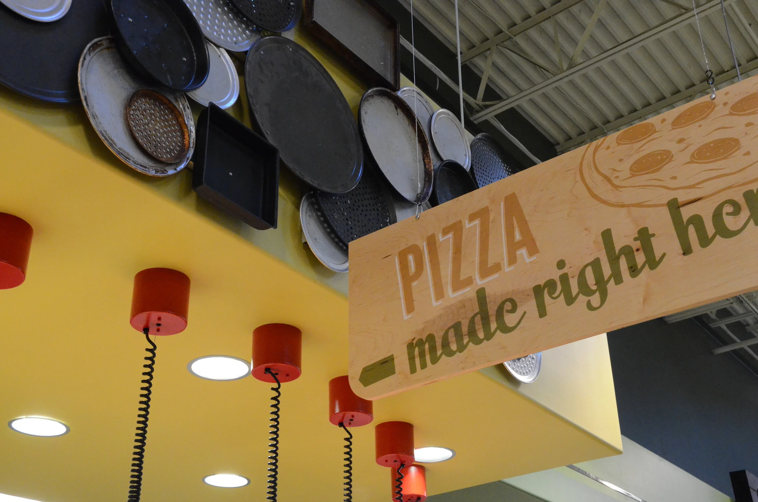
The design challenge presented for the interior was to blend the brand's earthy roots and the city's historical oil boomtown feel with the modern structures and aspirations of up-and-coming Oklahoma City.
The interior of the store, designed on a relatively small budget, focuses on modern applications of simple and rustic materials and techniques. This includes vintage illustrations printed in giant scale on sheet plywood and shou-sugi-ban signs (a Japanese wood preservation technique that involves charring the outermost layer of wood). The color palette was intentionally simplified to greens with minimal accent colors for maximum impact.
In searching for a way to connect the brand to the new market and show the company's excitement to be there, I developed what became the store tagline, "We're proud to be in OKC!"


CHALK IT UP TO THE HIGHEST STANDARDS
The project goal was to clearly convey Whole Foods Market quality standards in a piece shoppers would want to take home. With so many messages already in the space, I decided a simple, enticingly crisp photographic route was the best option.
With inspiration taken from the chalk artists in the store, I set about using the food as the message, with chalked call outs around the subject. The back side of the postcards featured a recipe using the product(s) featured in the photo and a brief bit of information about the quality of the products offered.
My project manager insisted on joining me on this shoot. I knew fish guts would be involved, so I was delighted. Once the set was ready with chalked words and food, I would ask him to move something an inch this way or that. Of course the fish (delivered just-gutted in a fresh bed of seaweed) was the best, as this was the only photo shoot where I got to tell my assistant, "A little fish guts never hurt anyone" as he smoothed scales and fins.
Each postcard was photographed almost entirely in one shot, even the ice.